I decided to rebrand because I felt as though I was already restricting myself too much but not even in a way that complimented the design work that I was producing. I had originally based my online presence on the colours that I most commonly used in my work and that built up a colour palette for the home page of my portfolio, taking each piece of work and applying one colour to it (fig. 1). This ensured visual consistency but in my opinion it did not give an instant impression on what I was creating as a designer and first impressions are made very quickly and having to scroll through lots of different pages to see my design style may put people off. I also thought that a new name was important because it is likely to stick with me now as I graduate and start to find jobs and freelance opportunities. Just having Hannah Rice and HJR Designs was too normal and would easily just get brushed to the bottom of people's memories, so I thought that the word studio instantly insinuated that it was creative but also left me the opportunity to decide exactly what discipline I wanted to be known for a long time in the future. The idea to change was with the main reason that it wouldn't restrict me too much in terms of what my outcomes would be. I thought that my last name was fun and because it is a little random it would stick in people's mind well and also allow me to play with it a little bit with my online presence and potentially if I ever take this further and actually open a studio. The word Rice can also be used as a stand alone and works well with out needing to have studio in front of it.
 |
| fig. 1 |


Website


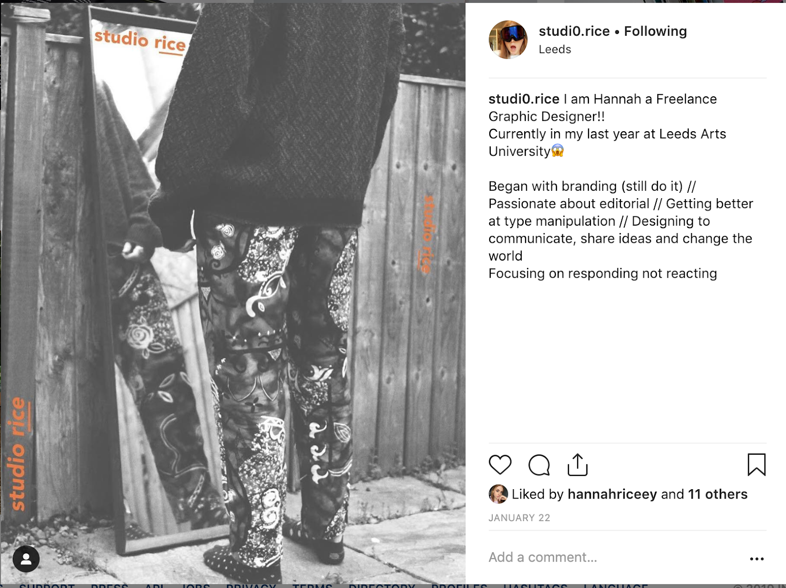
Instagram
Originally I had uploaded all of my instagram posts as single posts with a scroll through of the project. In the first few posts on the account I tried to be a little chatty in the descriptions and set the tone of me as a person but also how I want to come across on social media. I thought about the accounts that I personally like to follow and they often have a fairly chatty tone of voice with each of their posts. This was something that I too wanted to adopt in order to discuss my work that I am producing. I started by posting about 3 images per project and visually this worked really well aesthetically, but if this went out of sync with a singular post it still worked well because they did not rely on the placement of other images to build up the visuals.


CV


Portfolio
I chose a selection of what I would consider to be my strongest projects and used them in my portfolio. I thought that as I was currently looking for work in a variety of design studios, I would keep my portfolio varied and show a number of skills and approaches that I am comfortable with using.
Im not sure as to whether or not I might add project titles and little descriptions about each project, but this is something that I will discuss with someone for advice. Currently the portfolio is just to give an impression but the website is the platform that will go into more detail about each design project.


LinkedIn

No comments:
Post a Comment