The brief was open ended and down to me to interpret the song in anyway that I wished to create artwork for and keeping inline with the band themselves.
Lyrics
and so ill drink now
stop myself within a blink of falling to far
for you
what do you see now
her face
towards your eyes
could you imagine mine can you hear their cries
dont tell me i beg you dont tell me
i dont wanna know
i cant take it
and so ill smoke now cloud away the thoughts
take me to some place where i dont belong
what do you hear now
her breath
on your bed
could you imagine my words
from my truth
see them spill red
dont tell me
i beg you dont tell me
i dont wanna know
i cant take it

Key words/phrases
“Don’t tell me”
“Drink”
“Smoke”
“Bed”
“Red”
- a woman who is angry and wants to hurt that man for the way he is about to hurt her
- a faceless man with a tape around his mouth
- cigarettes and whisky
- red, blood, dark bed
- roughed up bed sheets
- lipstick stain on glass/mirror = cheating
The brainstorm lead me to the decision that an image focused outcome would work most effectively for the album artwork so using some different stock websites I gathered some imagery that I thought were relevant and could be experimented with.


Initial ideas
Idea 1
This first idea takes the idea of the lipstick being left as a hint that there is actually another girl on the scene, but the removal of her eyes is to suggest that she does not want to find out about her. The naivety of almost pretending to block it all out shows the vulnerability she may feel if she gets it confirmed and the whole relationship has to come to an end.
Idea 2
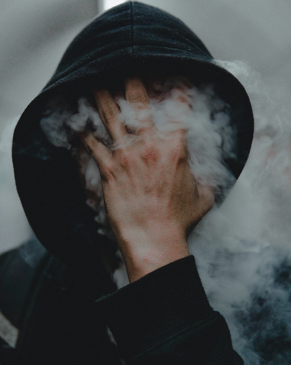
This idea draws from the lyrics the words 'drink' and 'smoke' in a more artistic sense and with the covering of his eyes representing that he might be unaware of the emotional distress that his actions are causing.


Idea 3
This idea is based on love metaphorically going down the drain and the added face shows a sense of distress and drowning that will be felt if the secret is revealed and confirmed.

Feedback

The Designers League feedback
A really useful way to get some design advice from people that are outside of my peer group is to upload designs to the facebook groupThe Designers League. This allows other graphic designers that are students and also in the creative industry to comment on the work and offer feedback.
Having discussed with the band and some peers about the initial ideas, I decided to develop the face in sink concept further as the final album artwork. I uploaded this design to The Designers League along with a short description about the band and concept.


I received a lot of positive feedback, but also a few suggestions on how the idea could be improved:
- remove the piping and plugs
- remove the face to make the concept more simple and cleaner
- Personally, I don't like the face. I think a sink with flowers is ICONIC enough
- Looks awesome, maybe ‘underground empire’ could be a touch bigger? But awesome 👌🏼


Having discussed with the band and some peers about the initial ideas, I decided to develop the face in sink concept further as the final album artwork. I uploaded this design to The Designers League along with a short description about the band and concept.


- remove the piping and plugs
- remove the face to make the concept more simple and cleaner
- Personally, I don't like the face. I think a sink with flowers is ICONIC enough
- Looks awesome, maybe ‘underground empire’ could be a touch bigger? But awesome 👌🏼
- would be cool with the face removed!
- agree, i don't like the face and also i'd be tempted to PS out that plug socket & maybe that pipe at the back. But thats me being uber critical as think as a whole i like ;)
- I would keep the face and remove the rest of the the body(shoulders neck etc)
- yeah, agree. If nothing else PS out the plug socket on the wall and some if not all the pipework and that weird thing sticking out the wall under the sink. Otherwise, it's awesome!
- I have to agree, I think the photography is awesome enough to just use that without adding the face 😊
- I thought the face was inside the sink, would be a cool idea as well. to superimpose it only in the sink as a composition work. All in all good work too. The face layer could maybe add a touch of yellow filter to add some colors, but just to see how it would look
- Only thing I would change is the typeface for Don't Tell Me. It looks like a typeface that wasn't originally designed to be a condensed face but then they altered it to be one. I'm guessing it's futura condensed? I would maybe change it to Trade Gothic Condensed. It tends to look slightly cleaner. Love the imagery you've got going on though.
In response to feedback
Typeface - Acumin Variable Concept
In response to the feedback from Designers League I started to remove the piping from around the sink and only leaving the main one. I did this using Adobe Photoshop and the clone tool predominately - it was a very long process to get it to look natural and not as though it had been extremely edited as some of the process images show in initial stages.


The Designers League Feedback 2
Having developed the idea on from the comments that I received from the designers league I then uploaded two different options so that I could then receive some final feedback. The main development with the album artwork was the removal of the piping underneath the sink and then on one of them also removing the plug.
The first option with the plug still part of it has more of the original tones of the unedited image, but when overlaying the face drowning into the bath I liked the slight blue tones that it added to the final outcome as I think it represented the cold feeling of emotional distress. This blue overlay was added by taking a pat of the bath image that was originally 'multiplied' over the top of the sink that didn't have any bubbles in it so that it was purely the colour, but with a slight texture.


Feedback
- the gone face is fine but the removed piping is too much in my eyes, my eyes can see something is missing and someone doesn’t know would feel something is out of place. Honestly don’t think the piping was that bad. Looks cleaner now though for sure
- Yea, I liked the piping. It feels mundane and raw
- I liked the piping, I prefer it without the face though 👍👍
- this is lovely, really understated but has a great vibe. Well done!
- I liked the face overlay. It looks a bit bare now but then I don't know the band
Final design
Rationale
The album artwork for a song about when you have suspicions someone you’re dating is seeing someone else. The persona in the song does not want to hear it from him because it will then confirm that everything will have to end.


No comments:
Post a Comment